How I got to play with shaders and interaction to make an interface livable
Over the last week I took part in the week-long project "Living in the interface". In this blog post I want to talk about my experience throughout the week, what I've learned and the fun I had!
After we all introduced ourselves on monday, we started with our first exercise: Annotating our most used websites. For that we used a new tool I haven't heard of up to that point, Figma, basically a shared inDesign-File geared for web design (as far as i understood it). The idea was to read the websites we've chosen thoroughly and then put words around them! We were to use words in the "to do" scheme, verbs, to describe the interactions in the websites interface - and I had a lot of fun thinking about my most used website: scryfall, a Magic: The Gathering card database.
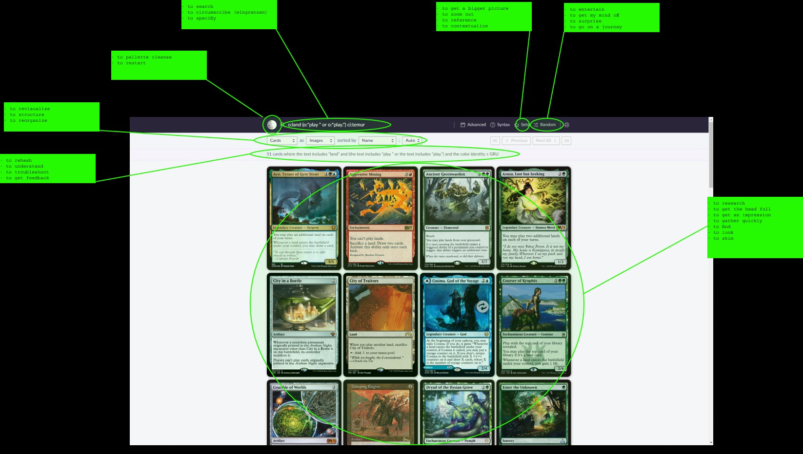
Thinking about the meaning each element of the interface had to me was interesting, as comparing scryfalls interface with youtubes interface (which I annotaded after) revealed, how many of the buttons on youtube basically do the same thing: Give me stuff to watch. Scryfall was more clean, distinct, with more empty space to relax on - something I was slowly starting to appreciate.
It was also interesting to see the approaches of others and what websites they chose. Many also had youtube, which always showed a little window into the private person and their interests, with the suggestions and all that!
Stephanie, our teacher for this project week, also introduced us to this website and gave has the homework to write a first blogpost! I am slowly growing more and more fond of its clean design without any ads or suggestions.
We als had to do some reading for the day. And I am going to take some time to talk about two of the texts we got:
Laurel Schwulst: My website is a shifting house next to a river of knowledge. What could yours be?
Schwulst discusses how a website is a medium just like any other. It is mostly used as a convenience, as tool, as something that is accessible, usable - but none of these characterisitcs are inherent to what websites ARE!
I loved this section in particular:
However, clarity is one of many possible intentions for a website. There are other legitimate states of mind capable of communication—a surprising, memorable, monumental, soothing, shocking, unpredictable, radically boring, bizarre, mind-blowing, very quiet and subtle, and/or amazing website could work. You also need not limit yourself to only one website—as perhaps you’d like to confuse or surprise with multiple.
Both because of "radically boring" as an intention for a website and because I love each and every use of "and/or". In all honesty though, the author here really opened my eyes: Websites are so much more than an advertisement space, data bases or social medias. Websites can be anything you want, and we should get back into making websites for ourselves, just to have a digital space of our own. Where we get to choose what they are - a garden, a personal construction site or the burnt out fireplace at the side of a challenging mountainous hiking trail, overlooking a valley of shimmering lakes in the morning sun.
The other text was not any less inspiring:
R. Poynor: The Hand that Rocks the Cradle
In this text from the mid-90s Poynor talks about the masters-degree programm "Computer Related Design"(CRD) at the Royal College of Art in London. They had a very experimental approach to their studies and tried to figure out how to design for the coming digital age. One part struck my as particularily curious: The design of the marble telephone answering machine.
In his telephone answering machine, incoming messages are represented as marbles that accumulate in an external groove, giving software processes a three-dimensional expression that the eye quickly grasps. It is the larger issue here, rather than the specifics of the design, that counts for Crampton Smith. "That's not a proposal for an answering machine," she says, "that's a proposal for an approach. In the past, the urge has been to put everything on screen because it's so easy and simple and clean and neat. But Durrell feels, and I think his approach has very much rubbed off on us all. That there are natural things that you just know how to do." This degree of "naturalness" and transparency is precisely what is missing, even now, from so many computer products.
This struck me as so interesting, because I myself have found myself going for the analog as opposed to the digital time and time again. Both the idea of a certain understandability of natural processes, things that just click for humans, and the idea of integrating or thinking of the analog as we are designing the digital - very complex topics I am going to dwell on a little bit longer.
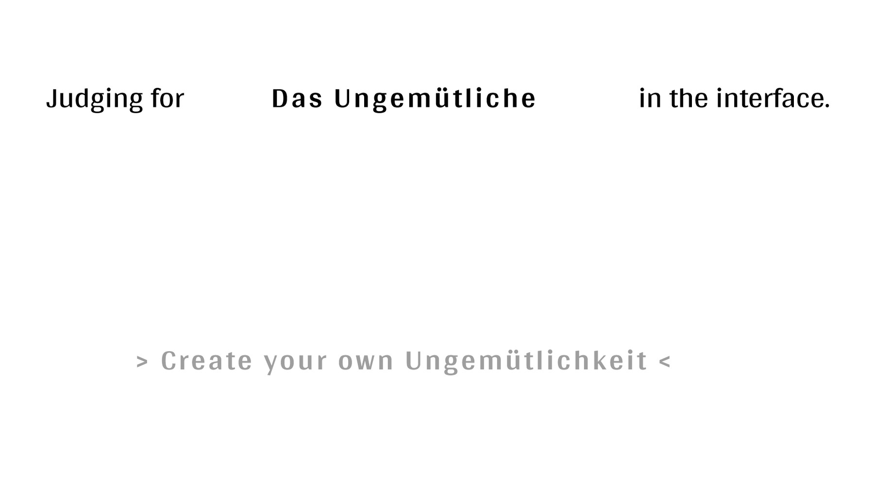
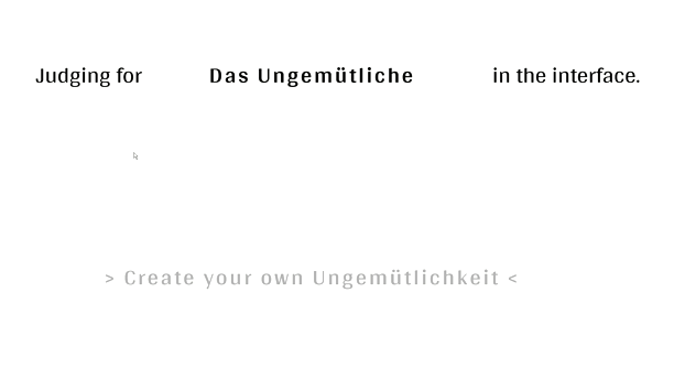
On day two, we played around a bit with our annotations, chose the verbs and other words we liked best of our classmates and created Statements for Living. Mine turned out to be: "Judging for Das Ungemütliche in the interface."
We then proceeded to start making a project space to typeset these statements - although I had no idea what that meant. I just chucked my sentence on there with a cute ASCII kitty. The next day I understood though what we were to do from now on: Create a website that kind of plays with our Statement for Living.
My first idea was to give the user a random assortment of things to then throw out/delete what they deemed not cozy. To create a cozy place by a sort of selection. This didn't come together too well in my head though - I didn't have a vision for it, it seemed very hazy at the time, only now that I write these sentences I really have gotten a grasp of what I wanted to do with my first idea. Instead I went for something that turned out to require more effort than I thought: A "Choose Your Own Ungemütlichkeit"!
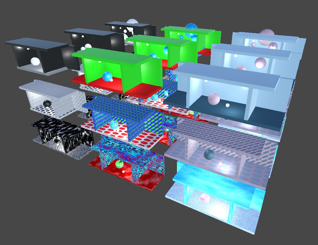
The idea was to let users build their own Ungemütlichkeit. They would be presented with a space and choose how to fill it - the color palette, the texture, how filled the space is. Inititially I also thought about letting the player choose what kind of shapes to fill the space with, but I cut that later for time concerns.
My first step was to write down what kind of "modes" these "properties" could have. The "Properties" being something like space and a mode of that being medium filled.
I ended up with black/white, krass, pastel for color palettwe, empty, filled, medium for space and noise, pattern, minimal for texture.
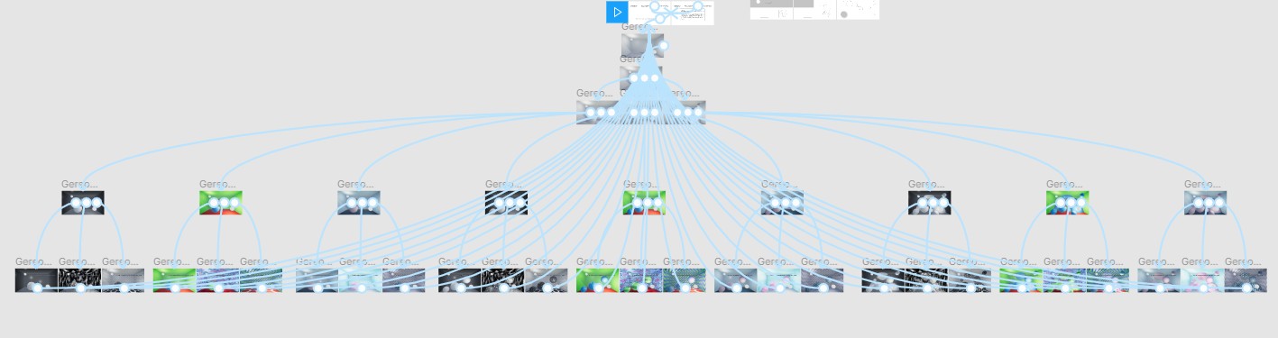
I sketched out the interaction-tree on figma in my own project and as I was doing that I realized: That's going to be more pictures of the space than I thought. What I didn't realize was, that with each new mode the amount of work I would need to do would multiply for each property of that mode. And with three modes with three properties each I was already at... a bunch!
So I decided to cut the shapes.
At this point I had a chat with our teacher. Through that talk I figured out, that I was going in a bit different direction than I might have hoped at the start of the seminar: I was creating a story, conveying emotion through content - not necessarily through the interaction. I was really into the story though, so I kept on going, especially as I had already something in mind to create the spaces with: SHADER GRAPH!
I love shader graph. It is Unity's node based shading plugin and I have been enjoying how playfully I can approach it.
My goal was to create a shader that I can modify to fill the spaces according to their textures (noise, pattern, minimal).
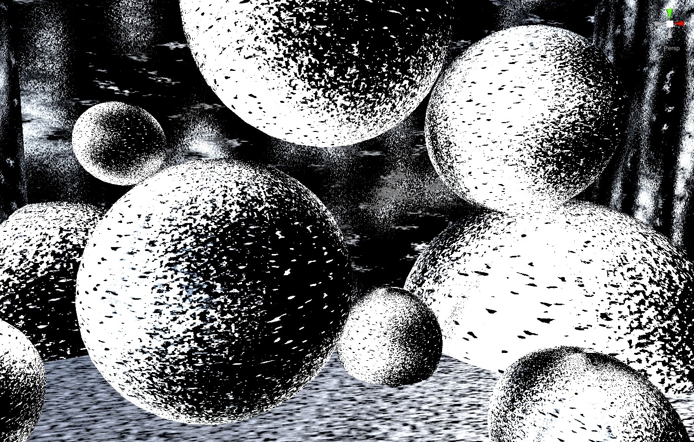
For the noise texture I mainly used a random noise and a gradient noise that you could blend in between, added a color property you could access from outside and then repeated that three times, each time with a selector so you could blend between three different types of noise mixtures. Here is how that looked like (with black/white and filled as the other properties):
And here is how that graph looks:
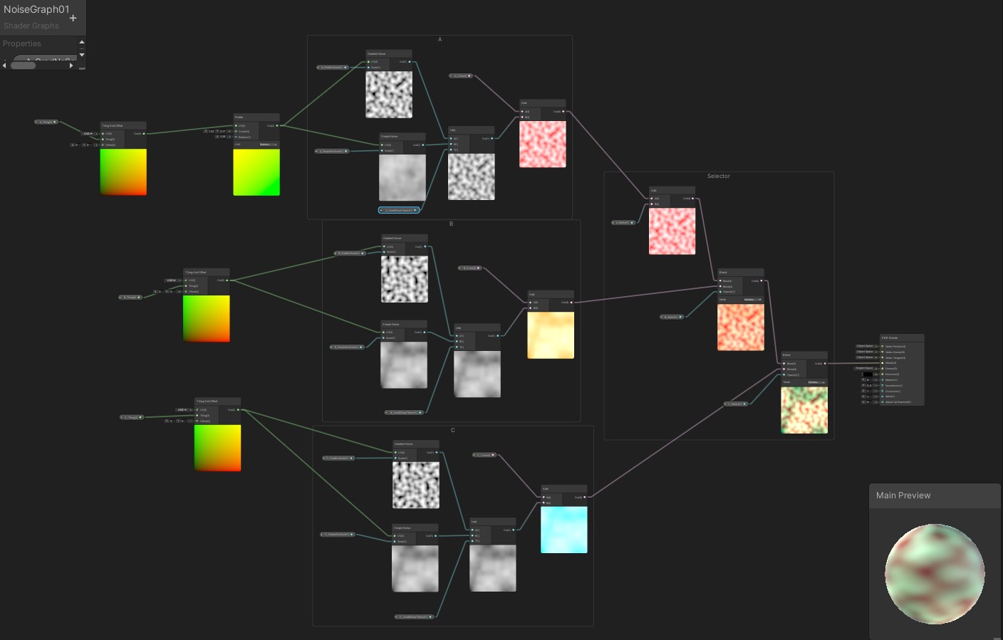
A tiling node is being fed into two noise textures who get coloured, this is repeated three times and added together.
The next texture was one made up of geometric textures. I first tried to look for some online but all had annoying watermarks all over the place, while I just wanted a clean honeycomb pattern. In the end I figured, why not try and make it myself? I played around with the generative shapes shader graph could make and figured out that if I put a bunch of hexagons in parallel to each other, finaggle their positions around a bit and then let it tile again, it creates a nice infinite and tileable honeycomb!
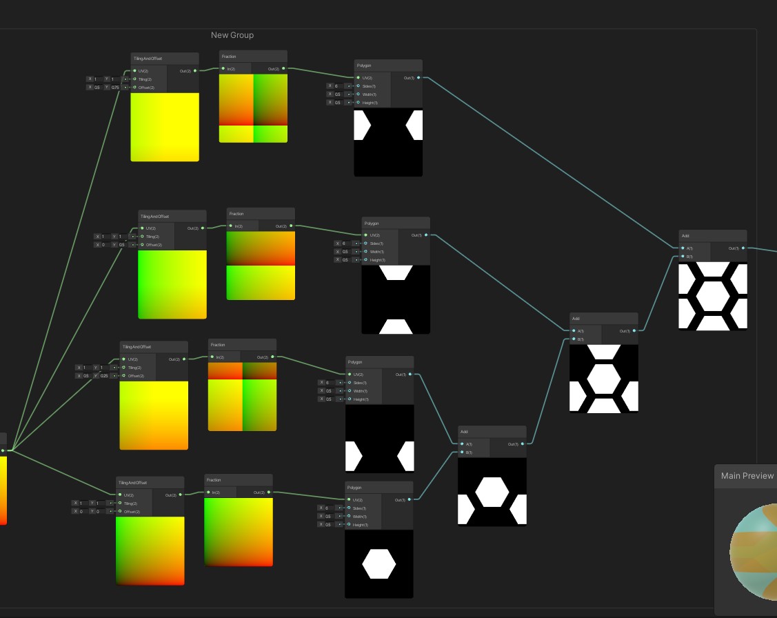
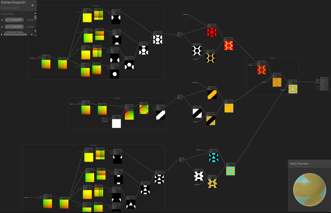
I continued to play around with the polygon generator in shader graph and put together two more shape texture I found interesting looking and then made them blendable again. This is how the graph turned out in the end:
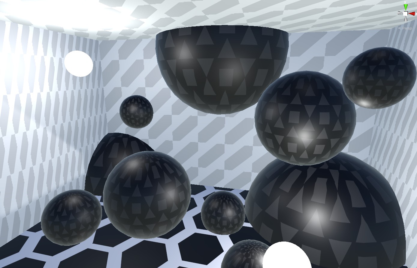
And this is how the room looked:
Throwing all of it together in Unity, then in Figma took some time, but the thinking part was done, so it was all a matter of how to push buttons quickly and work out a worflow that is efficient - in the end I mostly moved pieces around, copied them, put them after each other and pasted textures around, looked for colors and then took a bunch of screenshots to put on figma.
Here are the rooms in the Unity project:
I finished the prototype then by adding some small icons and tadah! Here is the thing:
Or if you want to watch it, I put a demo on Youtube!